
In recent years, larger screens have been encouraged, especially TV screens. Smaller screens of TVs are not even available anymore. They usually start from 42 inches and go up to 98 inches. This has brought an idea of responsiveness in application design, all types of UI, and web design. Responsive design can easily adapt according to the screen, regardless of the screen size. It has a fixed incremental ratio given to the elements, and if you move to a small screen, it contracts and shrinks all the elements along with text sizes. This technique is used in both web design and any type of UI design. The only thing that needs to be ensured is an image. It is preferred to use SVG elements so they can expand and do not lose their quality. Sometimes imagery is mandatory due to physical product photos. They need to be WebP so the image size can be reduced, animated images size can be decreased, and on bigger screens, a larger image can be loaded.
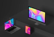
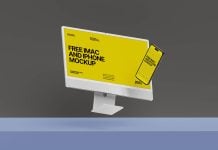
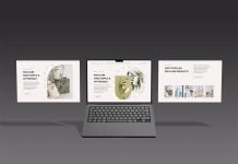
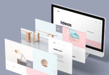
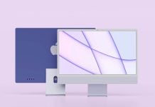
Today, we are sharing an iMac & iPhone Pro responsive website mockup in PSD format. Place your artwork on a smart object and get a realistic outcome.

Description:
Available Format: Layered PSD easy smart object insertion
License: Free for personal and commercial use
Zip File Includes: Photoshop PSD Files
Mockup Resolution: 8000 x 5500 px
Instructions:
1. Place artwork on smart objects
2. Photoshop requirement: Adobe Photoshop CS5+