Every new website is mobile-first. If your website is not a marketplace and you only sell products, then you should seriously consider optimising your online mobile shop and pay attention to its speed, which can drive much more traffic and, eventually, sales. Larger formats are reducing because people do not wish to sit for longer on the chair and surf; instead, they open the website at any moment while travelling, moving around, waiting for something or even eating; they do use mobile devices everywhere they go. Responsiveness of the website should be managed with separate CSS. A website that opens on a larger screen should adapt according to the screen resolution and load larger elements; when it comes to mobile, it should load the highly optimised design elements and resources that can open the website in a giffy. Such websites are preferred by search engines.
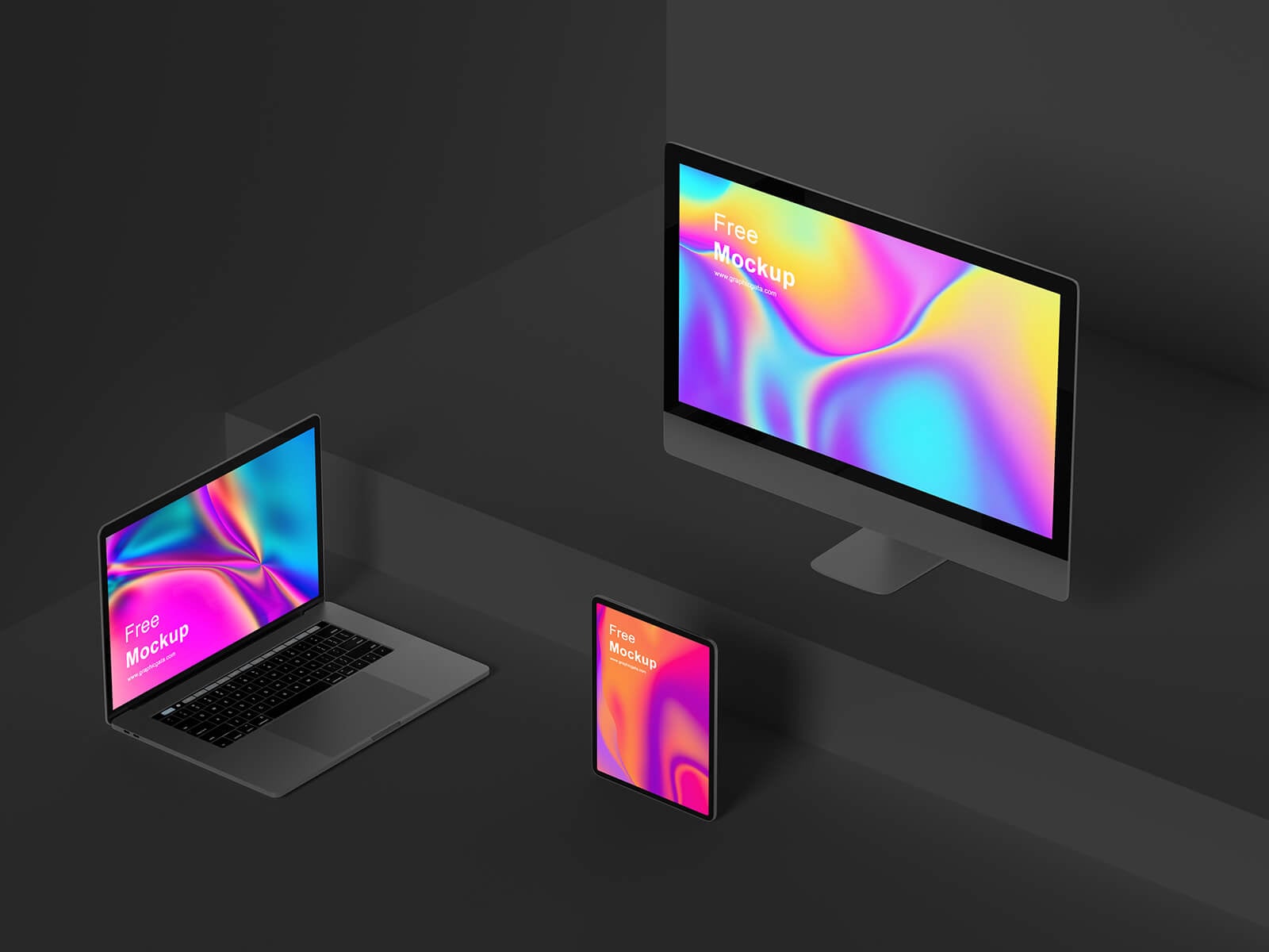
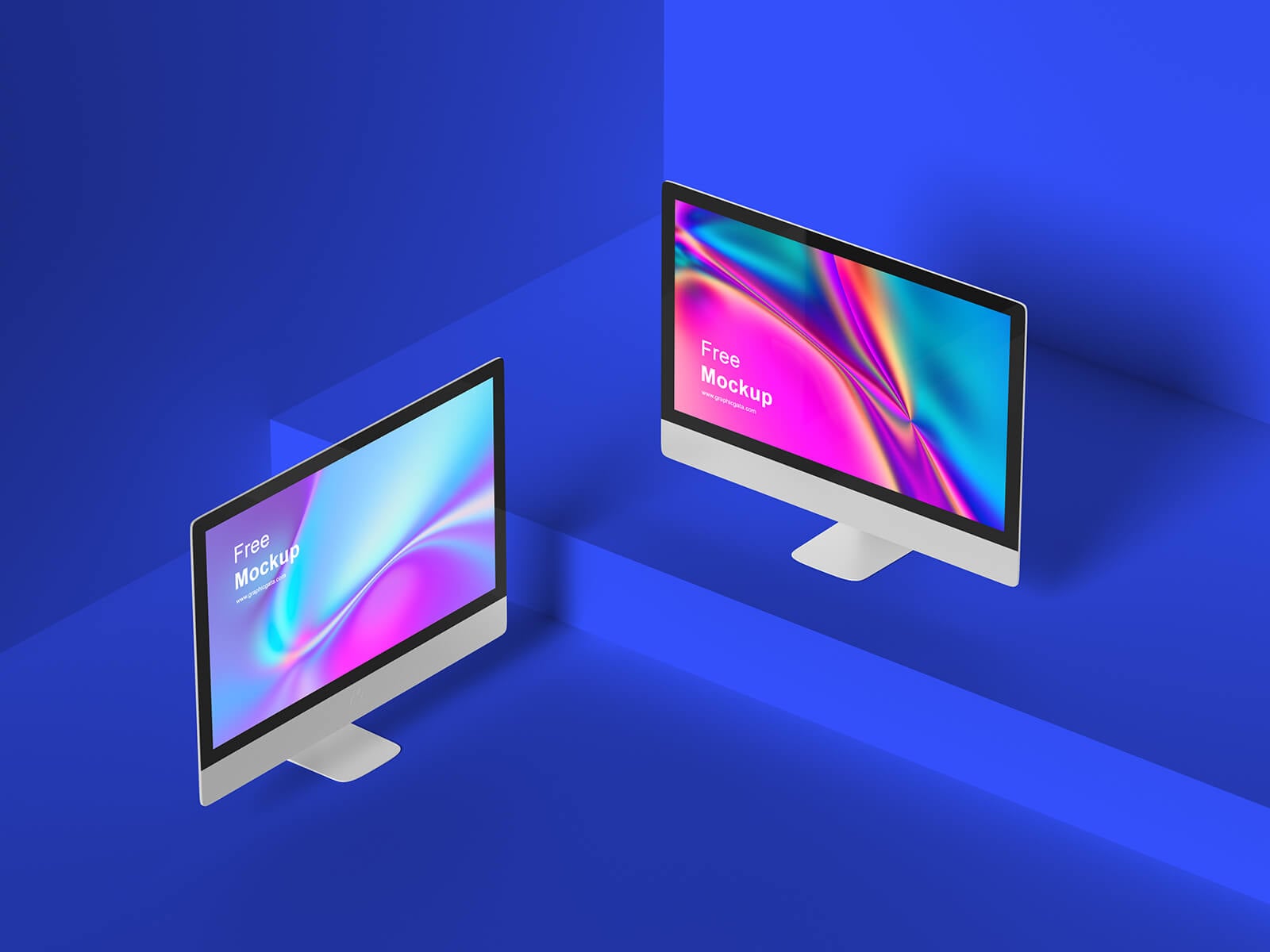
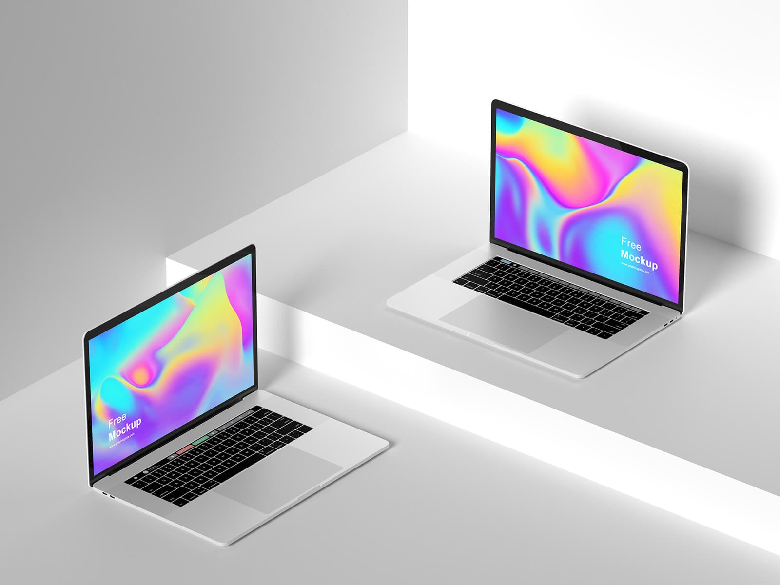
Today, we are sharing an isometric Apple device responsive website mockup in PSD format. Place your artwork on the smart object and get a realistic outcome.
Description:
Available Format: Layered PSD easy smart object insertion
License: Free for personal and commercial use
Zip File Includes: 3 Photoshop PSD files
Artwork Resolution: 4000 × 2680 pixels
Instructions:
1. Place your design on smart layer
2. Photoshop requirement: Adobe Photoshop CS5+


