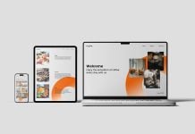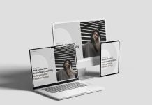

Web design has been transforming and is being preferred for small devices. Web traffic comes from small screens instead of large screens, and the main focus for web designers is on smaller screens, such as tablets and mobile devices, as well as smartwatches. Responsive web design is the only solution. It adapts according to screen size and makes the elements as big as the screen. Fixed pixels are discontinued, and SVG elements are preferred as they keep the transparencies and shapes, and they can be converted into code that makes them easy to render on the web page. PNGs are no longer used. You may see PNG used on the favicon only. For larger size photos, WebP is the best solution because it makes the size unrealistically small, and the large screen pages load in the blink of an eye.
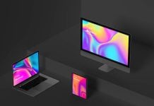
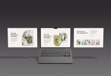
Today, we are sharing a responsive web design template mockup in PSD format. Place your artwork on a smart object and get a realistic outcome.

Available Format: Layered PSD through smart object insertion
License: Free for personal and commercial use
Zip File Includes: Photoshop PSD File
Resolution: 4500 x 3000 px
Instructions:
1. Place your web designs on smart objects
2. Photoshop requirement: Adobe Photoshop CS5+