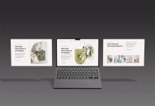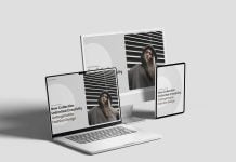

Fluid grids and media queries helped designers and web owners to quickly reach the goal of responsiveness in a web design. 90% of the active websites are responsive, and every new template is based on a mobile-first design. Before responsive web design, developers heavily relied on separate CSS for each screen. The main idea was that the visitor automatically loads the CSS that it is coming from. For example, there were three separate CSS files for a single website: one for desktop, one for tablet or phablet, and one for mobile. This practice has been obsolete as well, as it is considered an outdated practice because the main problem lay in fixed-width layouts. After fixed-width, fluid design was introduced, and everyone accepted it because once you reduce the size of the browser, it automatically adapts to the new size. However, nearly 10% of websites still follow non-responsive design, and they are usually old archival websites or unmaintained, discontinued web pages.
If you are looking for a responsive web design mockup, then look no further, as this is our latest addition to goodmockups. Download this free mockup and get a realistic outcome.

Description:
Available Format: Layered PSD UI Design
License: Free for personal and commercial use
Zip File Includes: Photoshop PSD file
Resolution: 4500 x 3000 px
Instructions:
1. Place your web design using smart objects
2. Photoshop requirement: Adobe Photoshop CS5+